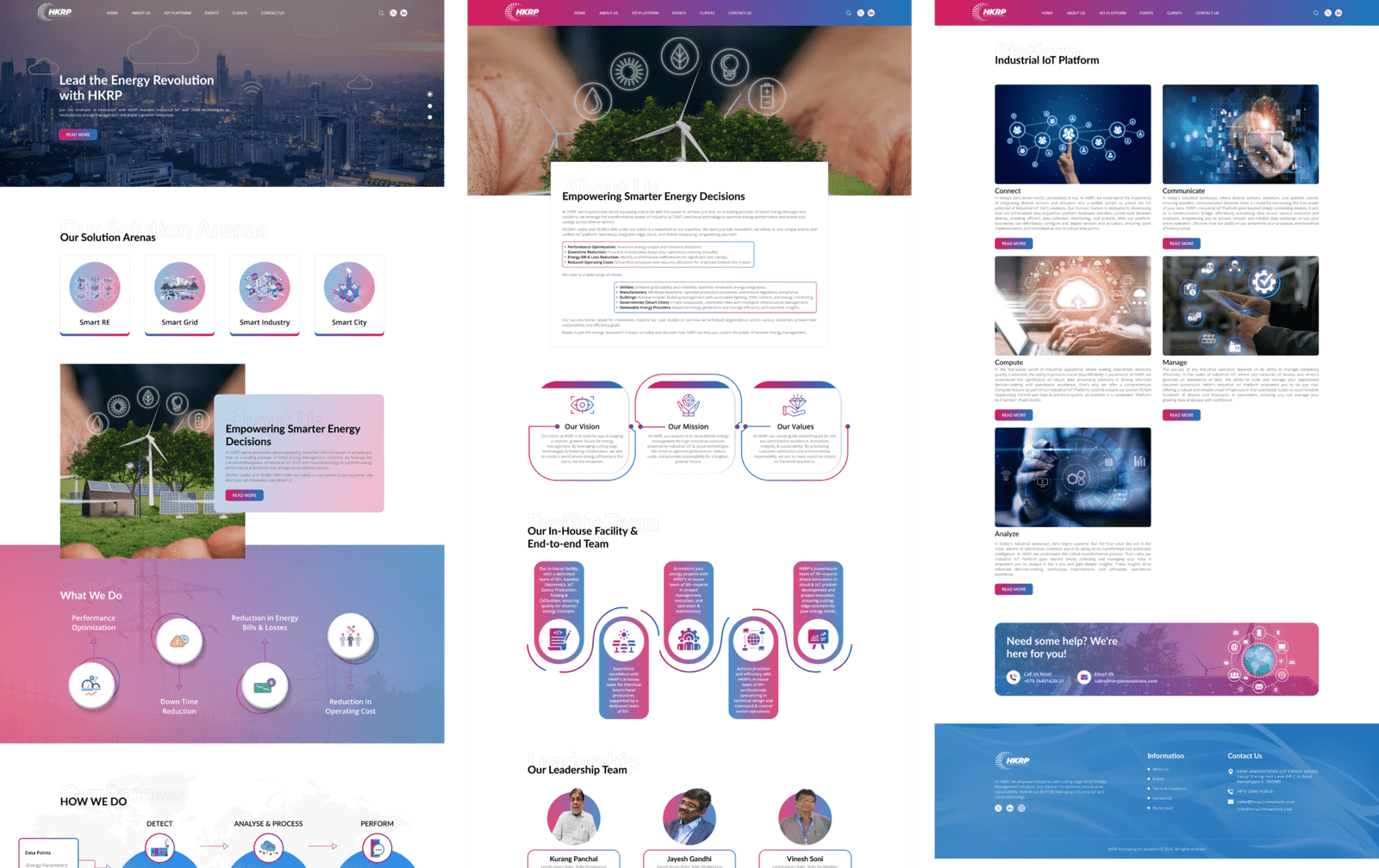
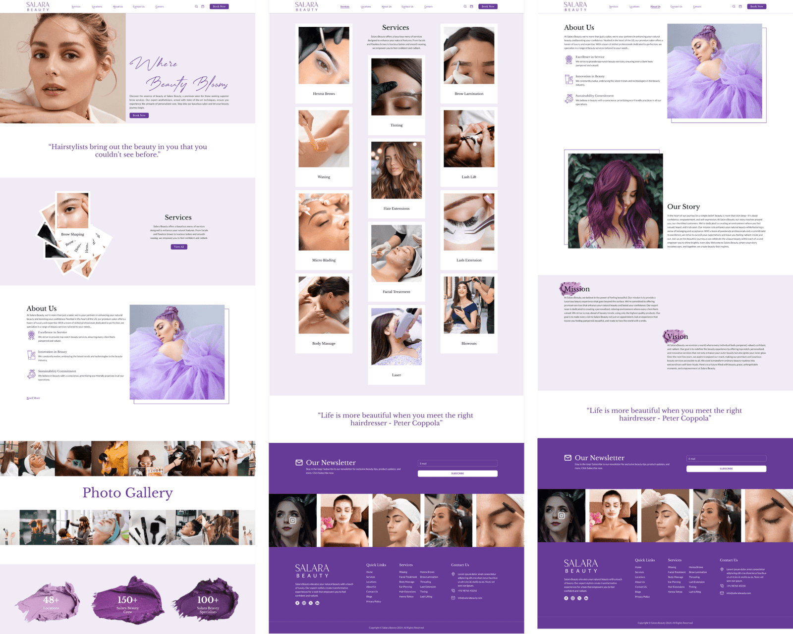
Designing for Multiple Screen Sizes
With the growing number of screen sizes available, it’s critical to create interfaces that adapt to every device. A mobile-first design strategy prioritizes the smallest screen and scales it up for larger devices. This ensures that even the most complicated designs work well on mobile, where the majority of people interact with websites and apps.
Optimizing Navigation Across Devices
One of the most important parts of a seamless user experience is ensuring that navigation is intuitive across all devices. Mobile consumers want simple menus, larger touch targets, and easy-to-read language. Desktop users may expect higher-level navigation options. It is critical to achieve a balance and avoid misunderstanding during transitions between device kinds.
To develop an intuitive navigation system:
- Use hamburger menus for mobile navigation.
- Use sticky headers on mobile and desktop to keep important navigation items visible.
- Make sure that buttons and links are easy to tap on touch devices.
Cross-Platform Functionality and Testing
Testing is an important step in creating a seamless cross-platform experience. Your website or app should be tested on a variety of devices and operating systems to uncover inconsistencies or functional difficulties. Use tools like Google’s Mobile-Friendly Test and cross-browser testing platforms to ensure that your design functions perfectly.
Ensuring cross-platform functionality can help identify problems before they occur. Testing ensures that your user experience remains consistent across all platforms.
Conclusion
Providing a consistent user experience across all devices is critical for keeping users and sustaining long-term engagement. By focusing on consistency, optimizing for many screen sizes, and extensively testing your platform across multiple devices, you can provide consumers with a frictionless experience. This will not only improve consumer satisfaction, but it will also lead to greater business results.
For businesses looking to enhance their user experience and design platforms that work flawlessly across all devices, 361 Degrees Marketing is here to help. Their team of experts specializes in delivering tailored digital solutions that ensure your users have a seamless and engaging experience, no matter the device.
