The Psychology of Logos: How to Design a Logo That Resonates with Your Audience
Introduction to Logo psychology
Logos are more than just artistic representations of a brand; they are effective psychological tools for communicating the brand’s essence, values, and promise to its target audience. Logo psychology studies how design aspects such as color, shape, and typography affect perceptions and behaviors. A well-designed logo can inspire emotions, increase brand awareness, and foster trust, making it an essential component of marketing and brand strategy.

Understanding the Elements of Effective Logos
Effective logos have several key elements that contribute to their impact:
1. Simplicity
Simplicity is essential for logos since it makes them immediately identifiable and remembered. Overly complex designs can be difficult to understand and remember, particularly when viewed in smaller sizes or from a distance. Consider classic logos such as Nike’s and Apple’s; their simplicity contributes much to their broad awareness.2. Versatility
A good logo should be adaptable enough to appear excellent in a variety of sizes and mediums, including business cards, billboards, and digital platforms. This adaptability ensures that the logo maintains its integrity and impact no matter where it is shown.3. Uniqueness
To stand out in an overcrowded marketplace, a logo must be distinctive. It should identify the brand from competitors while avoiding generic characteristics that cause it to blend in rather than stand out. Uniqueness contributes to the creation of a distinctand identifiable brand identity.Psychological Impact of Colors and Shapes in Logos
The colors and shapes used in logos majorly affect consumer impressions and emotions. Understanding these characteristics can help you create a logo effectively conveys the required message.
Colors:
Red: It is frequently associated with energy, passion, and excitement. It can elicit powerful emotions and motivate action, making it ideal for brands trying to generate a sense of urgency or boost appetite (for example, McDonald’s).
Blue: represents trustworthiness, dependability, and professionalism. It is widely used in businesses that require dependability and security, such as finance and healthcare (for example, IBM)
Yellow: It indicates optimism, warmth, and brightness. It may rapidly capture attention and is frequently employed by brands seeking to convey warmth and positivity (for example, Snapchat).
Green: represents growth, health, and peace. It is a common choice for wellness, environmental, and organic brands (for example, Starbucks).
Black: It represents sophistication, elegance, and authority. It is widely utilized by luxury companies and high-end products (for example, Chanel and Prada).
White: It is associated with purity, simplicity, and cleanliness. It is frequently used in minimalist designs to convey clarity and transparency (e.g., Apple).
Shapes:
Circles and ovals: symbolize unity, protection, and infinity. They can foster community and inclusivity (for example, Pepsi and Target).
Squares and rectangles: represent stability, reliability, and order. These forms can indicate a solid, trustworthy basis (for example, Microsoft or Lego).
Triangles: It represents power, strength, and direction. They can represent progress and innovation, particularly when pointing upward (for example, Adidas and Mitsubishi).
Curved lines: It can convey a vibrant and welcoming image, as seen in brands (For example, Coca-Cola and Nike.)
Case Studies: Successful Logo Designs and Their Psychological Appeal
Nike
The Nike swoosh is one of the world’s most recognizable logos. Its simplicity and motion express speed, movement, and athleticism, which perfectly complement the brand’s emphasis on sports and performance. The swoosh’s flow also conveys a sense of growth and ongoing improvement, which resonates with athletes’ goals.
Apple
An apple with a bite taken out exemplifies simplicity and beauty. The monotone color scheme enhances its processing, while the bite mark lends a sense of mystery and suspense. This design embodies Apple’s brand principles of innovation, premium quality, and user-friendly design.
Starbucks
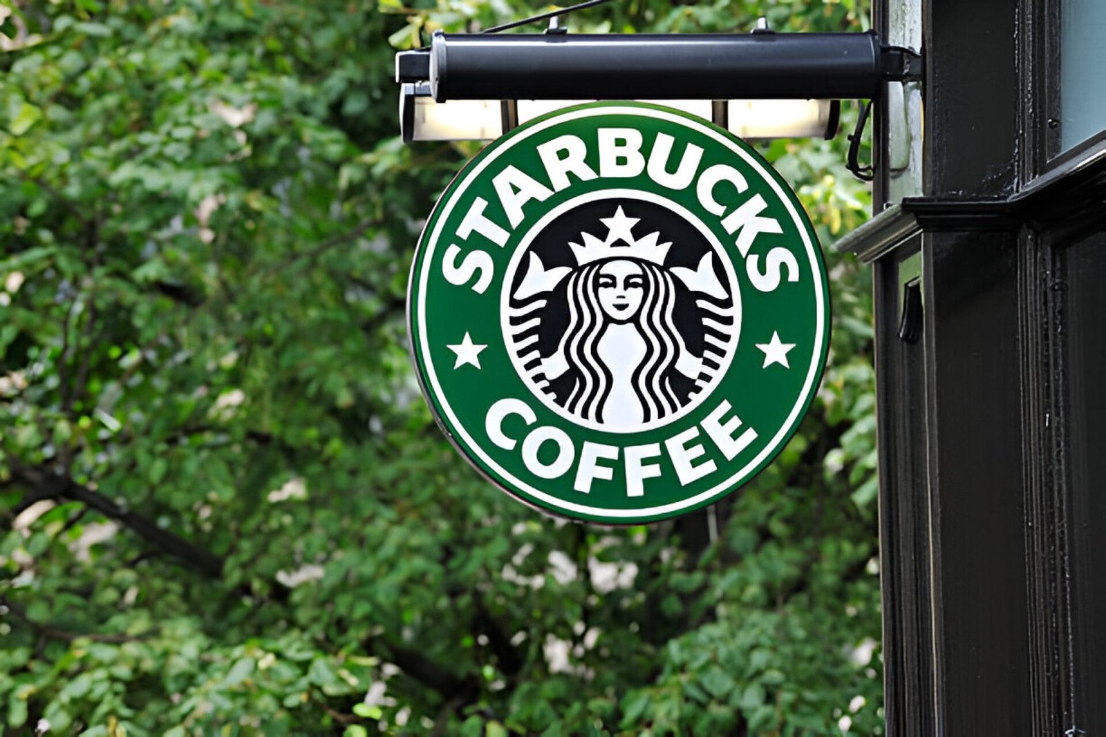
Starbucks’ logo shows a twin-tailed siren, referring to the brand’s maritime history and the seduction of coffee. The color green represents growth and sustainability, which aligns with the company’s dedication to ethical sourcing and environmental responsibility. The circular form of the logo promotes a sense of community and inclusion.
Practical Tips for Designing a Logo That Connects with Your Target Audience
Designing a logo that connects with your target audience requires a combination of creativity, research, and strategic thought.
Know your audience:
Understanding your target audience is the first step toward developing an effective logo. Conduct market research to understand their tastes, values, and expectations. This understanding will assist you in selecting design aspects that appeal to them.
Reflect the Brand Identity:
Your logo should represent your brand’s identity, including its mission, beliefs, and personality. Consider the message you want to express and ensure your logo reflects this idea. For example, a technology company may prioritize innovation and simplicity, but an organic food brand may prioritize nature and wellness.
Select appropriate colors and shapes:
Choose colors and shapes that fit your brand’s messaging and appealing to your target audience. Use color psychology to select shades that elicit the desired emotions and shapes that reinforce your brand’s core values. Try different combinations to see what works best.
Ensure versatility:
Design your logo to be versatile, so it looks well in various sizes and styles. To ensure that it retains its effect, test it against diverse backdrops, in black and white, and in other mediums.
Conclusion
In conclusion, a strong brand identity may be developed with the help of the psychology of logo design. Businesses may develop logos that not only stand out but also establish a strong emotional connection with their target audience by understanding the impact of design aspects and how they affect perceptions. Whether your company is new or well-established, using logo psychology will improve your branding and help you succeed in the long run.
Start Your
Marketing
Journey with Us
Marketing
Journey with Us

Start Your
Marketing
Journey with Us
Marketing
Journey with Us- Written by: 361 Degrees Marketing Team
- Posted on: July 8, 2024
- Tags: 361degreesmarketing, brand identity, brand story, Effective logos, Logo Design, Logo psychology


